How to Create Custom Cards in Flutter?
Learn to create custom cards in Flutter, enhancing your app’s UI with visually appealing & functional cards tailored to your requirements.
Follow the official documentation to set up Flutter: Flutter Installation Guide.
Table of Contents
Create Custom Cards in Flutter (2 Examples)
In this tutorial, we are going to learn two examples of code to implement the card design in Flutter with output.
Custom Card with Title, Description, Button
import 'package:flutter/material.dart';

void main() {
  runApp(MyApp());
}

class MyApp extends StatelessWidget {
  @override
  Widget build(BuildContext context) {
    return MaterialApp(
      home: Scaffold(
        appBar: AppBar(
          title: Text('Custom Card Example'),
        ),
        body: Center(
          child: Container(
            width: 300, // Adjust width as needed
            child: Card(
              elevation: 4, // Add shadow
              child: Padding(
                padding: EdgeInsets.all(16.0),
                child: Column(
                  mainAxisSize: MainAxisSize.min,
                  children: <Widget>[
                    Text(
                      'Custom Card Title',
                      style: TextStyle(
                        fontWeight: FontWeight.bold,
                        fontSize: 18,
                      ),
                    ),
                    SizedBox(height: 8),
                    Text(
                      'This is a custom card example.',
                      style: TextStyle(fontSize: 16),
                    ),
                    SizedBox(height: 16),
                    ElevatedButton(
                      onPressed: () {
                        print('Button Clicked!');
                      },
                      child: Text('Click Me'),
                    ),
                  ],
                ),
              ),
            ),
          ),
        ),
      ),
    );
  }
}- The
MaterialAppincludes aScaffoldwidget, which represents the main app layout structure. It has anAppBarwith the title “Custom Card Example”. - The
Scaffoldbody contains aCenterwidget, which centers its child widget (in this case, aContainer) horizontally and vertically. - The
Containerhas a fixedwidthof 300 pixels (you can adjust this value as needed). It contains aCardwidget. - The
Cardwidget has anelevationof 4, which adds a shadow effect to the card, making it appear raised from the background. - Inside the
Card, there is aPaddingwidget withEdgeInsets.all(16.0), which adds a 16-pixel padding around the content of the card. - The content of the card is a
Columnwidget withmainAxisSize: MainAxisSize.min, which means the column will only take up the minimum space required by its children. - The
Columncontains the following children:- A
Textwidget with the title “Custom Card Title”. It has a bold font weight and a font size of 18. - A
SizedBoxwith a height of 8 pixels, which adds vertical spacing. - Another
Textwidget with the text “This is a custom card example.” and a font size of 16. - Another
SizedBoxwith a height of 16 pixels, which adds more vertical spacing. - An
ElevatedButtonwith the text “Click Me”. When the button is pressed, it prints “Button Clicked!” to the console.
- A
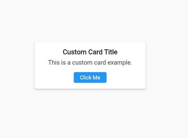
This code creates a centered custom card with a title, a description, and a button. The card has a fixed width of 300 pixels and a shadow effect thanks to the Card widget’s elevation property. The content of the card is vertically centered using the Column widget with mainAxisSize: MainAxisSize.min.
Output
Create Custom Cards in Flutter with Title, Description, Image, Button
import 'package:flutter/material.dart';

void main() {
  runApp(MyApp());
}

class MyApp extends StatelessWidget {
  @override
  Widget build(BuildContext context) {
    return MaterialApp(
      home: Scaffold(
        appBar: AppBar(
          title: Text('Custom Cards'),
        ),
        body: Padding(
          padding: EdgeInsets.all(16.0),
          child: FractionallySizedBox(
            widthFactor: 1,
            child: CustomCard(),
          ),
        ),
      ),
    );
  }
}

class CustomCard extends StatelessWidget {
  @override
  Widget build(BuildContext context) {
    return Card(
      elevation: 4.0,
      shape: RoundedRectangleBorder(
        borderRadius: BorderRadius.circular(16.0),
      ),
      child: Container(
        child: SingleChildScrollView( // Wrap with SingleChildScrollView
          child: Column(
            crossAxisAlignment: CrossAxisAlignment.start,
            children: [
              Image.network(
                'https://picsum.photos/400/200',
                fit: BoxFit.cover,
                width: double.infinity,
              ),
              Padding(
                padding: EdgeInsets.all(16.0),
                child: Column(
                  crossAxisAlignment: CrossAxisAlignment.start,
                  children: [
                    Text(
                      'Card Title',
                      style: TextStyle(
                        fontSize: 20.0,
                        fontWeight: FontWeight.bold,
                      ),
                    ),
                    SizedBox(height: 8.0),
                    Text(
                      'This is a custom card with a title, description, an image, and a button.',
                      style: TextStyle(fontSize: 16.0),
                    ),
                    SizedBox(height: 16.0),
                    SizedBox(
                      width: double.infinity,
                      child: ElevatedButton(
                        onPressed: () {
                          // Handle button press
                        },
                      child: Text('Button'),
                      style: ElevatedButton.styleFrom(
                        padding: EdgeInsets.symmetric(vertical: 16.0),
                        shape: RoundedRectangleBorder(
                          borderRadius: BorderRadius.circular(8.0),
                        ),
                        ),
                      ),
                    ),
                  ],
                ),
              ),
            ],
          ),
        ),
      ),
    );
  }
}
This is the CustomCard widget, which is a StatelessWidget. It returns a Card widget with an elevation of 4.0 and rounded corners with a border radius of 16.0. The Card contains a Container with a SingleChildScrollView, which allows the content to scroll vertically if it exceeds the available height.
Inside the SingleChildScrollView, there is a Column with the following children:
- An
Image.networkwidget that loads an image from the provided URL. The image has afitofBoxFit.coverand awidthofdouble.infinity, which means it will take up the full available width. - A
Paddingwidget that adds spacing around its child. - Another
Columninside thePaddingwith the following children:- A
Textwidget for the card title with a larger font size and bold weight. - A
SizedBoxfor vertical spacing. - Another
Textwidget for the card description. - Another
SizedBoxfor vertical spacing. - A
SizedBoxwithwidth: double.infinitythat contains anElevatedButton. The button has a custom style applied usingElevatedButton.styleFrom, which sets the padding and rounded corners for the button.
- A
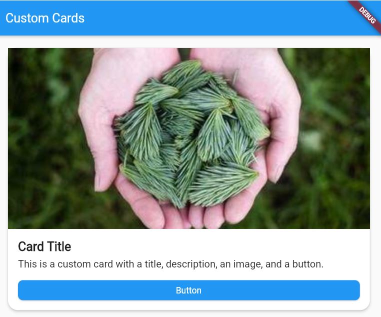
The purpose of this code is to create a custom card with an image, title, description, and button. The card has rounded corners and a drop shadow and the content is scrollable if it exceeds the available height.
The FractionallySizedBox in the body of the Scaffold ensures that the card takes up the full available width, while the Padding widget adds some spacing around the card.
Also, Want to learn How to Create Enum in Flutter?
Output
At the End
Furthermore, you can further customize the appearance and behavior of the card and its components by modifying the styles, spacing, and other properties as needed.

About Ambika Dulal
Lead Mobile App Developer and Tech Consultant specializing in Flutter, Dart, and Firebase.