How to Create a Custom Stepper in Flutter?
In this blog post, we’ll walk through how to create a custom widget for the stepper in Flutter using the flutter/material.dart package.
Steppers are a common UI pattern in mobile app development, especially when you want to guide users through a multi-step process. In Flutter, while there’s a default Stepper widget available, sometimes you may need a customized version to fit your specific design requirements.
Table of Contents
Let’s Start to create Stepper in Flutter
Before we dive into the customization, let’s ensure you have a basic understanding of Flutter and have the necessary tools set up. If you’re new to Flutter, you can follow the official Flutter documentation to get started with installation and project setup.
Custom Stepper in Flutter – Code Example
The SteperItemSection and _SteperItemSectionState classes work together to create a custom stepper widget in Flutter. The state manages the current step and builds the stepper UI dynamically based on the provided data. By customizing the Stepper widget and managing its state, the code achieves the desired functionality of a custom stepper widget.
We’ll start by examining the code provided below. This code sets up a simple Flutter app with a custom Stepper widget. Here’s a brief overview of the structure:
import 'package:flutter/material.dart';

void main() {
  runApp(MyApp());
}

class MyApp extends StatelessWidget {
  @override
  Widget build(BuildContext context) {
    return MaterialApp(
      title: 'Steper Example',
      theme: ThemeData(
        primarySwatch: Colors.blue,
      ),
      home: Scaffold(
        appBar: AppBar(
          title: Text('Steper Example'),
        ),
        body: SteperItemSection(
          contentWidget: CustomContentWidget(),
        ),
      ),
    );
  }
}

class CustomContentWidget extends StatelessWidget {
  @override
  Widget build(BuildContext context) {
    return Container(
      child: Center(
        child: Text(
          'Custom Content Widget',
          style: TextStyle(fontSize: 24.0),
        ),
      ),
    );
  }
}

class SteperItemSection extends StatefulWidget {
  final Widget contentWidget;
  const SteperItemSection({Key? key, required this.contentWidget})
      : super(key: key);

  @override
  State<SteperItemSection> createState() => _SteperItemSectionState();
}


class _SteperItemSectionState extends State<SteperItemSection> {
  int currentStep = 0;

  List<Map<String, String>> steplist = [
    {'task': '1', 'content': "Step 1"},
    {'task': '2', 'content': "Step 2"},
    {'task': '3', 'content': "Step 3"},
    {'task': '4', 'content': "Step 4"},
  ];

  @override
  Widget build(BuildContext context) {
    return LayoutBuilder(
      builder: (BuildContext context, BoxConstraints constraints) {
        double stepperHeight = constraints.maxHeight;
        double stepperWidth = constraints.maxWidth;

        return SingleChildScrollView(
          child: SizedBox(
            height: stepperHeight * 0.9, // Adjust as needed
            width: stepperWidth,
            child: Stepper(
              physics: const NeverScrollableScrollPhysics(),
              connectorThickness: 1,
              elevation: 0,
              type: StepperType.horizontal,
              currentStep: currentStep,
              controlsBuilder: (BuildContext context, ControlsDetails controls) {
                return const Row(
                  children: <Widget>[
                    SizedBox.shrink(),
                  ],
                );
              },
              onStepTapped: (step) => setState(() {
                currentStep = step;
              }),
              steps: getSteps(),
            ),
          ),
        );
      },
    );
  }

  void commonOnTap() {
    bool isLastStep = (currentStep == getSteps().length - 1);
    if (isLastStep) {
      //Do something with this information
    } else {
      setState(() {
        currentStep += 1;
      });
    }
  }

  final double fontSize = 8;
  List<Step> getSteps() {
    var itemList = steplist.asMap().entries.map<Step>((e) {
      var i = e.key;
      var item = e.value;
      return Step(
        state: currentStep > i ? StepState.complete : StepState.indexed,
        isActive: currentStep >= i,
        title: const SizedBox.shrink(),
        label: Text(
          StepState.indexed == StepState.indexed ? item['content'] ?? "" : "",
          style: TextStyle(
              fontSize: fontSize,
              color: currentStep >= i ? Colors.blue : null),
        ),
        content: widget.contentWidget,
      );
    });
    return itemList.toList();
  }
}- MyApp: The root widget of the application. It configures the theme and sets up the scaffold with an app bar and the custom stepper widget.
- CustomContentWidget: A simple widget that displays custom content. In this example, it just shows a centered text.
- SteperItemSection: The custom stepper widget. It uses a
LayoutBuilderto determine its dimensions and then wraps theStepperwidget inside aSingleChildScrollViewto ensure it’s scrollable if needed. TheStepperwidget is configured with a horizontal layout and some customizations such as disabling scrolling, setting connector thickness, and more. - _SteperItemSectionState: The state class for the
SteperItemSection. It manages the current step and builds the list of steps dynamically based on the provided data.
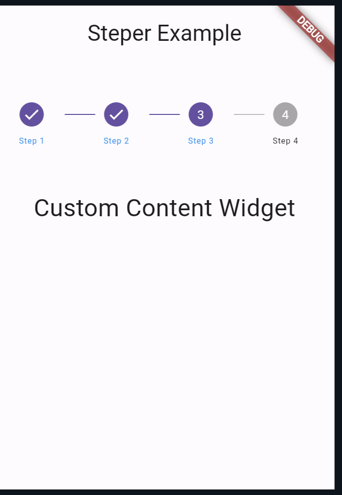
Output:
Also Read:
Conclusion
Creating a custom stepper widget in Flutter gives you full control over its appearance and behavior, allowing you to tailor it to your app’s specific requirements. By understanding how to customize the Stepper widget and manage its state, you can create intuitive and user-friendly multi-step processes in your Flutter apps.

About Ambika Dulal
Lead Mobile App Developer and Tech Consultant specializing in Flutter, Dart, and Firebase.