How to Add Back Button in Appbar in Flutter?

In this guide, we’ll explore multiple methods to add back button in AppBar in Flutter with clear examples.
By creating a custom AppBar widget, you encapsulate the AppBar’s behavior and appearance into a single modular component. This promotes code organization and makes it easier to manage and maintain your app’s structure. Rather than repeating AppBar configurations across multiple screens, you can simply reuse the custom AppBar widget.
We also explore about common appbar widget below the blog.
Table of Contents
- 2 Methods to Add Back Button in Appbar in Flutter
- Add Back Button in Appbar in Flutter dynamically
- At the End
A custom AppBar allows you to define a consistent design pattern for your app. You can set default styles, such as colors, typography, and iconography, ensuring that the AppBar maintains a cohesive look and feel across various screens. Consistency in design enhances user experience and reinforces brand identity.
2 Methods to Add Back Button in Appbar in Flutter
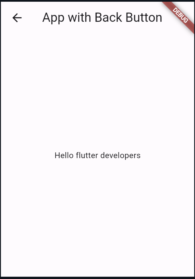
Method 1: Use the leading Property to Add the Back Button in the Appbar in Flutter
import 'package:flutter/material.dart';

void main() {
  runApp(MyApp());
}

class MyApp extends StatelessWidget {
  @override
  Widget build(BuildContext context) {
    return MaterialApp(
      home: Scaffold(
        appBar: AppBar(
          title: Text('App with Back Button'),
          leading: IconButton(
            icon: Icon(Icons.arrow_back),
            onPressed: () {
              Navigator.pop(context);
            },
          ),
        ),
        body: Center(
          child: Text('Hello World!'),
        ),
      ),
    );
  }
}
Output:
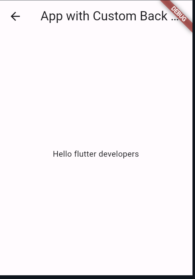
Method 2: Custom AppBar Widget
import 'package:flutter/material.dart';

void main() {
  runApp(MyApp());
}

class MyApp extends StatelessWidget {
  @override
  Widget build(BuildContext context) {
    return MaterialApp(
      home: Scaffold(
        appBar: CustomAppBar(
          title: 'App with Custom Back Button',
        ),
        body: Center(
          child: Text('Hello World!'),
        ),
      ),
    );
  }
}

class CustomAppBar extends StatelessWidget implements PreferredSizeWidget {
  final String title;

  CustomAppBar({required this.title});

  @override
  Widget build(BuildContext context) {
    return AppBar(
      title: Text(title),
      leading: IconButton(
        icon: Icon(Icons.arrow_back),
        onPressed: () {
          Navigator.pop(context);
        },
      ),
    );
  }

  @override
  Size get preferredSize => Size.fromHeight(kToolbarHeight);
}
Output:
Add Back Button in Appbar in Flutter dynamically
The CustomAppBar class to make it dynamic so that you can pass the title, back icon, and background color from any class. Here’s the updated code:
import 'package:flutter/material.dart';

class CustomAppBar extends StatelessWidget implements PreferredSizeWidget {
  final String title;
  final IconData? backIcon;
  final Color? backgroundColor;

  CustomAppBar({
    required this.title,
    this.backIcon,
    this.backgroundColor,
  });

  @override
  Widget build(BuildContext context) {
    return AppBar(
      title: Text(title),
      leading: IconButton(
        icon: Icon(backIcon ?? Icons.arrow_back),
        onPressed: () {
          Navigator.pop(context);
        },
      ),
      backgroundColor: backgroundColor,
    );
  }

  @override
  Size get preferredSize => Size.fromHeight(kToolbarHeight);
}
Now, when you use the CustomAppBar widget, you can pass the desired title, back icon, and background color as parameters. Here’s an example of how to use it:
import 'package:flutter/material.dart';

void main() {
  runApp(MyApp());
}

class MyApp extends StatelessWidget {
  @override
  Widget build(BuildContext context) {
    return MaterialApp(
      home: Scaffold(
        appBar: CustomAppBar(
          title: 'App with Custom Back Button',
          backIcon: Icons.arrow_back_ios, // Custom back icon
          backgroundColor: Colors.blue, // Custom background color
        ),
        body: Center(
          child: Text('Hello developers.'),
        ),
      ),
    );
  }
}
In this example, I’ve customized the CustomAppBar by providing a different back icon (Icons.arrow_back_ios) and background color (Colors.blue). You can adjust these parameters as needed to achieve the desired appearance for your app’s app bar.
Custom AppBar widgets promote scalability in your Flutter project. As your app expands with new features and screens, you can continue to leverage the same custom AppBar implementation, ensuring that navigation remains intuitive and cohesive regardless of the app’s size or complexity.
Also Read:
At the End
In summary, a custom AppBar in Flutter not only helps maintain clean, reusable code but also promotes consistency, flexibility, and scalability in your app’s design and development process.
By encapsulating AppBar functionality into a modular component, you can streamline development efforts, improve code maintainability, and deliver a seamless user experience.
You can follow the official: details of font sizes in flutter to explore more.

About Ambika Dulal
Lead Mobile App Developer and Tech Consultant specializing in Flutter, Dart, and Firebase.