How to Create a Button in Flutter?
In this blog, we’ll explore learn how to create a button in Flutter app development and how it contributes to efficiency and code maintainability.
Among these, buttons play a crucial role in user interaction and navigation within an app. However, repetitive button styling and functionality across different screens can lead to redundant code and decreased maintainability.
Table of Contents
- Why need to learn how to create a button in Flutter?
- CommonFilledColorButton – how to create a button in Flutter
- How We Can Use the Above Button?
- At the End
Why need to learn how to create a button in Flutter?
In any Flutter app, buttons are ubiquitous elements used for actions like navigation, submission of forms, or triggering specific functions.
While Flutter provides versatile button widgets like ElevatedButton, TextButton, and OutlinedButton, customizing these buttons according to app-specific design guidelines can be repetitive.
Developers often find themselves writing similar button styling code across multiple screens, leading to code duplication and increased chances of inconsistencies.
CommonFilledColorButton – how to create a button in Flutter
To mitigate this issue, developers can leverage the concept of common type buttons. These are reusable button components encapsulating commonly used styling and functionality, thus promoting code reusability and maintainability.
Let’s delve into an example implementation of a common type button in Flutter: CommonFilledColorButton.
import 'package:flutter/material.dart';


class CommonFilledColorButton extends StatelessWidget {
  final GestureTapCallback? onPressed;
  final String? buttonTitle;
  final Color? borderColor;
  final Color? fillColor;
  final Color? textColor;
  final bool isFilled;
  final Widget? child;
  final bool? isFullWidth;
  const CommonFilledColorButton(
      {super.key,
      this.onPressed,
      this.child,
      this.buttonTitle,
      this.borderColor,
      this.isFilled = false,
      this.isFullWidth,
      this.fillColor,
      this.textColor});

  @override
  Widget build(BuildContext context) {
    return SizedBox(
      width: isFullWidth == null ? 340 : null,
      child: OutlinedButton(
        style: OutlinedButton.styleFrom(
          elevation: 4,
          backgroundColor: isFilled == true ? fillColor ?? Colors.blue : null,
          side: BorderSide(width: 1.5, color: borderColor ?? Colors.blue),
          shape: const RoundedRectangleBorder(
              borderRadius: BorderRadius.all(Radius.circular(20))),
        ),
        onPressed: onPressed,
        child: child ??
            Text(
              buttonTitle ?? "",
              style: TextStyle(
                  color: isFilled == true
                      ? textColor ?? Colors.black
                      : kPrimaryColor,
                  fontSize: 14,
                  fontWeight: FontWeight.bold),
            ),
      ),
    );
  }
}
Key Features of CommonFilledColorButton
- Reusability:
CommonFilledColorButtonencapsulates common button styling and functionality, allowing developers to reuse it across different screens and components within the app. - Customizability: The button’s appearance can be easily customized using parameters like
borderColor,fillColor, andtextColor, enabling consistent adherence to the app’s design guidelines. - Flexibility: Developers can toggle between filled and outlined button styles using the
isFilledparameter, providing flexibility in catering to diverse design requirements. - Efficiency: By abstracting away repetitive button styling code into a common type button component, developers can significantly reduce boilerplate code and improve development efficiency.
- Scalability: As the app evolves and new features are introduced, maintaining consistent button styling becomes effortless with common type buttons, ensuring a cohesive user experience across the app.
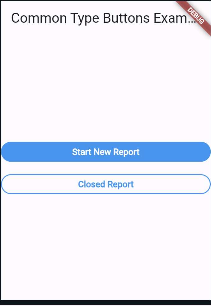
How We Can Use the Above Button?
import 'package:flutter/material.dart';

class MyApp extends StatelessWidget {
  @override
  Widget build(BuildContext context) {
    return MaterialApp(
      home: Scaffold(
        appBar: AppBar(
          title: Text('Common Type Buttons Example'),
        ),
        body: Center(
          child: Column(
            mainAxisAlignment: MainAxisAlignment.center,
            children: [
              CommonFilledColorButton(
                buttonTitle: 'Start New Report',
                isFilled: true,
                onPressed: () => print("pressed"),
              ),
              const SizedBox(height: 20),
              CommonFilledColorButton(
                buttonTitle: 'Closed Report',
                onPressed: () => print("pressed"),
              ),
            ],
          ),
        ),
      ),
    );
  }
}

class StartReportPage extends StatelessWidget {
  static const String routeName = '/startReport';

  @override
  Widget build(BuildContext context) {
    return Scaffold(
      appBar: AppBar(
        title: Text('Start Report Page'),
      ),
      body: Center(
        child: Text('Start Report Page Content'),
      ),
    );
  }
}

class ClosedReportPage extends StatelessWidget {
  static const String routeName = '/closedReport';

  @override
  Widget build(BuildContext context) {
    return Scaffold(
      appBar: AppBar(
        title: Text('Closed Report Page'),
      ),
      body: Center(
        child: Text('Closed Report Page Content'),
      ),
    );
  }
}

void main() {
  runApp(MyApp());
}

class CommonFilledColorButton extends StatelessWidget {
  final GestureTapCallback? onPressed;
  final String? buttonTitle;
  final Color? borderColor;
  final Color? fillColor;
  final Color? textColor;
  final bool isFilled;
  final Widget? child;
  final bool? isFullWidth;
  const CommonFilledColorButton(
      {super.key,
      this.onPressed,
      this.child,
      this.buttonTitle,
      this.borderColor,
      this.isFilled = false,
      this.isFullWidth,
      this.fillColor,
      this.textColor});

  @override
  Widget build(BuildContext context) {
    return SizedBox(
      width: isFullWidth == null ? 340 : null,
      child: OutlinedButton(
        style: OutlinedButton.styleFrom(
          elevation: 4,
          backgroundColor: isFilled == true ? fillColor ?? Colors.blue : null,
          side: BorderSide(width: 1.5, color: borderColor ?? Colors.blue),
          shape: const RoundedRectangleBorder(
              borderRadius: BorderRadius.all(Radius.circular(20))),
        ),
        onPressed: onPressed,
        child: child ??
            Text(
              buttonTitle ?? "",
              style: TextStyle(
                  color: isFilled == true
                      ? textColor ?? Colors.white
                      : Colors.blue,
                  fontSize: 14,
                  fontWeight: FontWeight.bold),
            ),
      ),
    );
  }
}
Output:
Also Read:
At the End
By encapsulating commonly used button styling and functionality into reusable components like CommonFilledColorButton, developers can streamline development efforts, reduce code redundancy, and deliver an exceptional user experience.
Embracing this practice not only accelerates development but also lays the foundation for scalable and maintainable Flutter apps.
You can visit Flutter’s official documentation for more.

About Ambika Dulal
Lead Mobile App Developer and Tech Consultant specializing in Flutter, Dart, and Firebase.