How to use defaulttabcontroller in Flutter?
In this blog post, we’ll explore how to use DefaultTabController in Flutter to create stylish and attractive tab layouts in Flutter. Flutter offers a powerful widget called DefaultTabController for managing tabbed interfaces in your app.
Table of Contents
- What is DefaultTabController in Flutter?
- How does DefaultTabController work?
- Using DefaultTabController Flutter with Style:
- Conclusion
What is DefaultTabController in Flutter?
DefaultTabController simplifies the process of managing tabs in Flutter by coordinating between the TabBar and TabBarView widgets. It handles the state of the currently selected tab index, making it easy to switch between different tab views seamlessly.
How does DefaultTabController work?
The DefaultTabController widget works by connecting two essential components:
- TabBar: Displays the tabs at the top of the screen.
- TabBarView: Contains the content corresponding to each tab.
Whenever a user selects a tab, DefaultTabController updates the index and ensures that the appropriate content is displayed in the TabBarView.
Using DefaultTabController Flutter with Style:
Let’s enhance our tab examples with custom styling and background colors to create a more visually appealing layout.
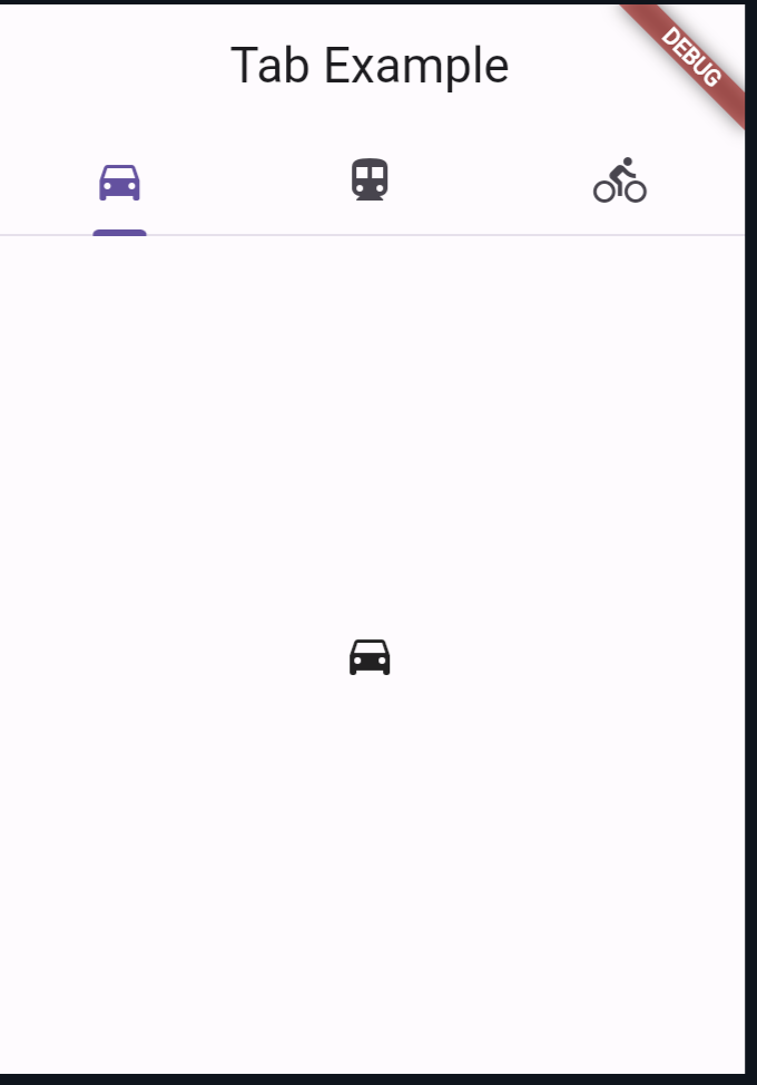
Example 1: Basic Usage of defaulttabcontroller flutter
import 'package:flutter/material.dart';

void main() {
  runApp(MyApp());
}

class MyApp extends StatelessWidget {
  @override
  Widget build(BuildContext context) {
    return MaterialApp(
      home: DefaultTabController(
        length: 3, // Specify the number of tabs
        child: Scaffold(
          appBar: AppBar(
            title: Text('Tab Example'),
            bottom: TabBar(
              tabs: [
                Tab(icon: Icon(Icons.directions_car)),
                Tab(icon: Icon(Icons.directions_transit)),
                Tab(icon: Icon(Icons.directions_bike)),
              ],
            ),
          ),
          body: TabBarView(
            children: [
              Icon(Icons.directions_car),
              Icon(Icons.directions_transit),
              Icon(Icons.directions_bike),
            ],
          ),
        ),
      ),
    );
  }
}
In this example, we have created a basic Flutter app with three tabs. Each tab displays a different icon, and when a tab is selected, the corresponding icon is displayed below the TabBar.
Output:
Example 2: Basic Usage with Styled Tabs
import 'package:flutter/material.dart';

void main() {
  runApp(MyApp());
}

class MyApp extends StatelessWidget {
  @override
  Widget build(BuildContext context) {
    return MaterialApp(
      home: DefaultTabController(
        length: 3,
        child: Scaffold(
          appBar: AppBar(
            backgroundColor: Colors.blueGrey, // Set app bar background color
            title: Text('Stylish Tab Example'),
            bottom: TabBar(
              indicatorColor: Colors.white, // Set tab indicator color
              tabs: [
                Tab(
                  icon: Icon(Icons.directions_car),
                  text: 'Cars',
                ),
                Tab(
                  icon: Icon(Icons.directions_transit),
                  text: 'Transit',
                ),
                Tab(
                  icon: Icon(Icons.directions_bike),
                  text: 'Bikes',
                ),
              ],
            ),
          ),
          body: Container( // Set background color for tab content
            color: Colors.blueGrey.shade200,
            child: TabBarView(
              children: [
                Icon(Icons.directions_car, size: 100),
                Icon(Icons.directions_transit, size: 100),
                Icon(Icons.directions_bike, size: 100),
              ],
            ),
          ),
        ),
      ),
    );
  }
}
Output:
In this example, we have customized the tabs by adding text along with icons. The TabBarView contains placeholders for displaying different content corresponding to each tab.
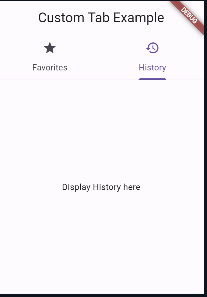
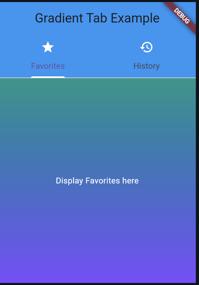
Example 2: Custom TabBar and TabBarView with Gradient Background
import 'package:flutter/material.dart';

void main() {
  runApp(MyApp());
}

class MyApp extends StatelessWidget {
  @override
  Widget build(BuildContext context) {
    return MaterialApp(
      home: DefaultTabController(
        length: 2,
        child: Scaffold(
          appBar: AppBar(
            backgroundColor: Colors.blue, // Set app bar background color
            title: Text('Gradient Tab Example'),
            bottom: TabBar(
              indicatorColor: Colors.white, // Set tab indicator color
              tabs: [
                Tab(
                  icon: Icon(Icons.star, color: Colors.white),
                  text: 'Favorites',
                ),
                Tab(
                  icon: Icon(Icons.history, color: Colors.white),
                  text: 'History',
                ),
              ],
            ),
          ),
          body: Container(
            // Apply gradient background to tab content
            decoration: BoxDecoration(
              gradient: LinearGradient(
                begin: Alignment.topCenter,
                end: Alignment.bottomCenter,
                colors: [Colors.teal, Colors.deepPurpleAccent],
              ),
            ),
            child: TabBarView(
              children: [
                Center(
                    child: Text('Display Favorites here',
                        style: TextStyle(color: Colors.white))),
                Center(
                    child: Text('Display History here',
                        style: TextStyle(color: Colors.white))),
              ],
            ),
          ),
        ),
      ),
    );
  }
}
Output:
Also Read:
Conclusion
DefaultTabController simplifies the process of managing tabs in Flutter apps by providing a convenient way to coordinate between TabBar and TabBarView. By understanding its usage and working principles, you can create more interactive and engaging user interfaces in your Flutter applications.
You can follow the official: details of font sizes in Flutter to explore more.

About Ambika Dulal
Lead Mobile App Developer and Tech Consultant specializing in Flutter, Dart, and Firebase.