In this blog post, we’ll explore three different approaches to implementing a Checkbox in Flutter, each with its advantages and use cases.
Among these, the Checkbox widget is commonly used for capturing binary user choices.
Checkboxes allow users to select one or more items from a list of options, making them an essential component in forms, settings screens, and more. In Flutter, checkboxes are represented by the Checkbox widget, which provides properties for customization and event handling.
Table of Contents

3 Ways to Create Checkbox in Flutter
Approach 1: Using ListTile for the Checkbox in Flutter
The first approach involves using the ListTile widget, which provides a convenient way to display a row with leading and trailing widgets, typically used in lists.
We can place a Checkbox widget as the leading widget and a RichText widget containing the label text as the title. This approach simplifies the layout and is suitable for scenarios where the checkbox is part of a list or a similar structure.
import 'package:flutter/material.dart';

void main() {
  runApp(MaterialApp(
    home: Scaffold(
      appBar: AppBar(
        title: Text('Terms and Conditions'),
      ),
      body: Center(
        child: TermsAndConditionsWidget(),
      ),
    ),
  ));
}

class TermsAndConditionsWidget extends StatefulWidget {
  @override
  _TermsAndConditionsWidgetState createState() => _TermsAndConditionsWidgetState();
}

class _TermsAndConditionsWidgetState extends State<TermsAndConditionsWidget> {
  bool agreedToTerms = false;

  @override
  Widget build(BuildContext context) {
    return ListTile(
      leading: Checkbox(
        activeColor: Colors.yellow,
        checkColor: Colors.black,
        value: agreedToTerms,
        onChanged: (newValue) {
          setState(() {
            agreedToTerms = newValue!;
          });
        },
      ),
      title: RichText(
        text: TextSpan(
          text: 'I have read and agree ',
          style: Theme.of(context).textTheme.bodyMedium,
          children: <TextSpan>[
            TextSpan(
              text: "Terms & Conditions ",
              style: Theme.of(context).textTheme.bodyMedium?.copyWith(fontWeight: FontWeight.bold),
            ),
            TextSpan(
              text: "of the Application",
              style: Theme.of(context).textTheme.bodyMedium?.copyWith(fontWeight: FontWeight.bold),
            ),
          ],
        ),
      ),
    );
  }
}
Approach 2: Use Row and Expanded for the Checkbox in Flutter
The second approach employs a Row widget with two children: a Checkbox widget and an Expanded widget containing a GestureDetector with a RichText child.
The Expanded widget ensures that RichText fills the available space, allowing users to tap anywhere on the text to toggle the checkbox state.
This approach offers more flexibility in terms of layout customization and is suitable for standalone checkbox components.
import 'package:flutter/material.dart';

void main() {
  runApp(MaterialApp(
    home: Scaffold(
      appBar: AppBar(
        title: Text('Terms and Conditions'),
      ),
      body: Center(
        child: TermsAndConditionsWidget(),
      ),
    ),
  ));
}

class TermsAndConditionsWidget extends StatefulWidget {
  @override
  _TermsAndConditionsWidgetState createState() => _TermsAndConditionsWidgetState();
}

class _TermsAndConditionsWidgetState extends State<TermsAndConditionsWidget> {
  bool agreedToTerms = false;

  @override
  Widget build(BuildContext context) {
    return Row(
      crossAxisAlignment: CrossAxisAlignment.center,
      children: [
        Checkbox(
          activeColor: Colors.yellow,
          checkColor: Colors.black,
          value: agreedToTerms,
          onChanged: (newValue) {
            setState(() {
              agreedToTerms = newValue!;
            });
          },
        ),
        Expanded(
          child: GestureDetector(
            onTap: () {
              setState(() {
                agreedToTerms = !agreedToTerms;
              });
            },
            child: Padding(
              padding: const EdgeInsets.symmetric(vertical: 8.0),
              child: RichText(
                text: TextSpan(
                  text: 'I have read and agree ',
                  style: Theme.of(context).textTheme.bodyMedium,
                  children: <TextSpan>[
                    TextSpan(
                      text: "Terms & Conditions ",
                      style: Theme.of(context).textTheme.bodyMedium?.copyWith(fontWeight: FontWeight.bold),
                    ),
                    TextSpan(
                      text: "of the Application",
                      style: Theme.of(context).textTheme.bodyMedium?.copyWith(fontWeight: FontWeight.bold),
                    ),
                  ],
                ),
              ),
            ),
          ),
        ),
      ],
    );
  }
}
Approach 3: Checkbox widget with Adjustments
The third approach revisits the original code provided by the user, making necessary adjustments for clarity and completeness.
It uses a Row widget with a Checkbox widget and a SizedBox containing a RichText widget.
This straightforward approach may be preferred if the layout requirements match the provided code structure.
import 'package:flutter/material.dart';

class TermsAndConditionsWidget extends StatefulWidget {
  @override
  _TermsAndConditionsWidgetState createState() =>
      _TermsAndConditionsWidgetState();
}

class _TermsAndConditionsWidgetState extends State<TermsAndConditionsWidget> {
  bool agreedToTerms = false;

  @override
  Widget build(BuildContext context) {
    return Row(
      crossAxisAlignment: CrossAxisAlignment.center,
      mainAxisAlignment: MainAxisAlignment.start,
      mainAxisSize: MainAxisSize.min,
      children: [
        Checkbox(
          activeColor: Colors.yellow,
          checkColor: Colors.black,
          value: agreedToTerms,
          onChanged: (newValue) {
            setState(() {
              agreedToTerms = newValue!;
            });
          },
        ),
        SizedBox(
          width: MediaQuery.of(context).size.width / 1.6,
          child: RichText(
            text: TextSpan(
              text: 'I have read and agree ',
              style: Theme.of(context).textTheme.bodyMedium,
              children: <TextSpan>[
                TextSpan(
                  text: "Terms & Conditions ",
                  style: Theme.of(context)
                      .textTheme
                      .bodyMedium
                      ?.copyWith(fontWeight: FontWeight.bold),
                ),
                TextSpan(
                  text: "of the Application",
                  style: Theme.of(context)
                      .textTheme
                      .bodyMedium
                      ?.copyWith(fontWeight: FontWeight.bold),
                ),
              ],
            ),
          ),
        ),
      ],
    );
  }
}

void main() {
  runApp(MaterialApp(
    home: Scaffold(
      appBar: AppBar(
        title: Text('Terms and Conditions'),
      ),
      body: Center(
        child: TermsAndConditionsWidget(),
      ),
    ),
  ));
}
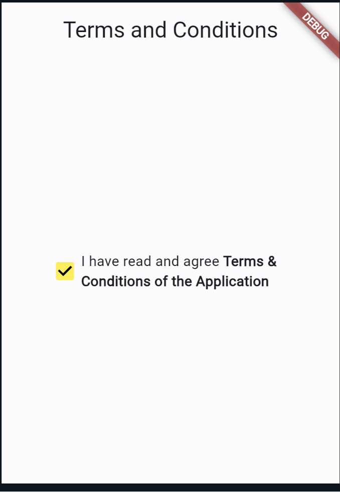
Output of all approaches:

Also Read:
At the End
This blog post explored three different approaches to implementing a Checkbox in Flutter. Each approach offers its own set of advantages and can be tailored to suit specific use cases.
Whether you’re building a simple form or a complex user interface, understanding these approaches will empower you to create interactive and user-friendly applications with Flutter.
You can visit Flutter’s official documentation for more.
