How to Make a Bottom Navigation Bar in Flutter?
In this article, you will learn how to make a bottom navigation bar in flutter using a practical code example to illustrate the process of making a bottom navigation bar.
Table of Contents
- What is Bottom Navigation Bar in flutter ?
- Code Example of How to Make a Bottom Navigation Bar in Flutter
- Conclusion
What is Bottom Navigation Bar in flutter ?
The Bottom Navigation Bar in Flutter is a user interface component that allows easy navigation between different sections or destinations within a mobile app.
It is typically located at the bottom of the screen and consists of multiple icons or labels representing various sections or pages of the application. Users can tap on these icons to switch between different screens or functionalities within the app.
The Bottom Navigation Bar often comes with distinct icons or labels associated with different sections, such as home, search, favorites, profile, settings, etc.
When a user taps on an icon or label in the bottom navigation bar, it triggers a change in the content displayed on the screen, enabling swift navigation between different parts of the application.
In Flutter, the Bottom Navigation Bar is implemented using the BottomNavigationBar widget, which allows developers to define the structure, icons, and labels for the navigation items and manage the switching of content or screens associated with each item.
This widget is customizable, enabling developers to tailor its appearance, including the number of items, their icons, labels, colors, and behavior, based on the specific requirements and design of the application.
Code Example of How to Make a Bottom Navigation Bar in Flutter
Let’s dive into a practical example of implementing a Bottom navigation bar in a Flutter application. This code excerpt showcases the basic structure of a Flutter Bottom navigation bar.
import 'package:flutter/material.dart';
class MyBottomNavigationBar extends StatefulWidget {
@override
_MyBottomNavigationBarState createState() => _MyBottomNavigationBarState();
}
class _MyBottomNavigationBarState extends State<MyBottomNavigationBar> {
int _selectedIndex = 0;
static List<Widget> _screens = [
ScreenOne(),
ScreenTwo(),
ScreenThree(),
];
void _onItemTapped(int index) {
setState(() {
_selectedIndex = index;
});
}
@override
Widget build(BuildContext context) {
return Scaffold(
body: _screens[_selectedIndex],
bottomNavigationBar: BottomNavigationBar(
items: const <BottomNavigationBarItem>[
BottomNavigationBarItem(
icon: Icon(Icons.home),
label: 'Home',
),
BottomNavigationBarItem(
icon: Icon(Icons.business),
label: 'Business',
),
BottomNavigationBarItem(
icon: Icon(Icons.school),
label: 'School',
),
],
currentIndex: _selectedIndex,
selectedItemColor: Colors.amber[800],
onTap: _onItemTapped,
),
);
}
}
class ScreenOne extends StatelessWidget {
@override
Widget build(BuildContext context) {
return const SizedBox(
child: Center(
child: Text('Screen One'),
),
);
}
}
class ScreenTwo extends StatelessWidget {
@override
Widget build(BuildContext context) {
return const SizedBox(
child: Center(
child: Text('Screen One'),
),
);
}
}
class ScreenThree extends StatelessWidget {
@override
Widget build(BuildContext context) {
return const SizedBox(
child: Center(
child: Text('Screen One'),
),
);
}
}
void main() {
runApp(MaterialApp(
home: MyBottomNavigationBar(),
));
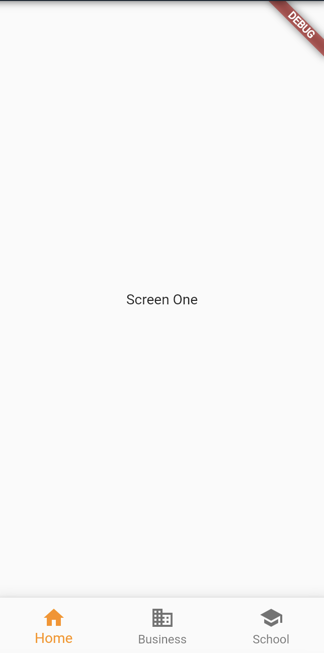
}This code demonstrates the creation of a bottom navigation bar with three navigation items: ‘Home’, ‘Business’, and ‘School’. Tapping on these items switches between three different screens (ScreenOne, ScreenTwo, and ScreenThree) displaying their respective text content.
The BottomNavigationBar widget manages the navigation items and the currently selected index. Upon tapping an item, it triggers the _onItemTapped function, updating the selected index and consequently displaying the corresponding screen in the body of the Scaffold.
This code represents a basic implementation of a bottom navigation bar in Flutter, allowing users to navigate between different screens within the app.
Output:
Navigation Bars play a main in “How to Make a Bottom Navigation Bar in Flutter”
- Enhanced User Experience:
- Provides intuitive and quick access to different sections or features of the app.
- Enables users to navigate seamlessly between various screens or functionalities.
- Organized Information Architecture:
- Structures content and functionalities, improving the app’s overall organization.
- Helps users understand the app’s layout and find what they need efficiently.
- Clear Hierarchy and Navigation:
- Establishes a clear hierarchy of information, guiding users through different levels or sections of the app.
- Facilitates easy movement between primary and secondary features or content.
- Visual Appeal and Branding:
- Contributes to the app’s aesthetics by offering a consistent and visually appealing navigation design.
- Allows customization to reflect the app’s branding and design language.
- Increased Accessibility and Discoverability:
- Makes essential features more discoverable, leading to higher user engagement.
- Enhances the accessibility of various parts of the app, ensuring no content is buried or hard to find.
- Facilitates Task Completion:
- Assists users in achieving their goals by simplifying the process of accessing and using different app features.
- Reduces user frustration and increases satisfaction by providing a smooth navigational experience.
Also Read Related Tutorials
- Understanding the Essence of BuildContext in Flutter Development
- How to make custom drawer for the flutter application?
Conclusion
The MyBottomNavigationBar widget, functioning as a StatefulWidget, manages the navigation bar’s state, tracking the selected index for the displayed screens.
Within the Scaffold, the BottomNavigationBar widget houses the navigation items, each associated with an icon and a label. Upon tapping an item, the _onItemTapped function is invoked, updating the selected index, and subsequently altering the displayed screen in the main body of the app.
The code includes three distinct Screen widgets, each presenting unique content—’Screen One’, ‘Screen Two’, and ‘Screen Three’. These screens dynamically change and display their respective content as the user interacts with the bottom navigation bar.
This implementation serves as a foundational template that developers can expand upon and customize. It demonstrates the basic structure of a bottom navigation bar along with the associated screens, laying the groundwork for more complex and feature-rich applications.
You can follow the official documentation to set up Flutter: Flutter Installation Guide.

About Ambika Dulal
Lead Mobile App Developer and Tech Consultant specializing in Flutter, Dart, and Firebase.