How to Create a Drop-Down in Flutter?
In this blog post, we’ll walk through the process of creating a drop-down in Flutter using the DropDownTextField widget.
Dropdowns are a common user interface element used in mobile app development for selecting an option from a list of choices. In Flutter, creating a dropdown is straightforward and can be customized according to your app’s design requirements.
Table of Contents
- Getting Started for drop-down in Flutter
- Setting Up the Project
- Creating the drop-down in Flutter
- Implementing the Dropdown Functionality
- Conclusion
Getting Started for drop-down in Flutter
To begin, make sure you have Flutter installed on your machine. If not, you can follow the official installation guide to set it up.
Once Flutter is installed, create a new Flutter project or open an existing one in your preferred code editor.
Setting Up the Project
We’ll start by setting up a basic Flutter project with a DropDownTextField widget that encapsulates our dropdown functionality.
import 'package:flutter/material.dart';

void main() {
  runApp(MaterialApp(
    home: Scaffold(
      appBar: AppBar(
        title: Text('Dropdown Text Field Demo'),
      ),
      body: Center(
        child: Padding(
          padding: const EdgeInsets.all(20.0),
          child: DropDownTextField(
            title: 'Select Item', // Provide a title
          ),
        ),
      ),
    ),
  ));
}
Creating the drop-down in Flutter
Now, let’s create the DropDownTextField widget. This widget will contain the dropdown functionality.
class DropDownTextField extends StatefulWidget {
  final String? title;

  const DropDownTextField({
    Key? key,
    this.title,
  }) : super(key: key);

  @override
  State<DropDownTextField> createState() => _DropDownTextFieldState();
}
Implementing the Dropdown Functionality
In the DropDownTextField class, we’ll implement the dropdown functionality.
class _DropDownTextFieldState extends State<DropDownTextField> {
late String currentItem;
List<String> listItems = ['Item 1', 'Item 2', 'Item 3']; // Demo list of items
@override
void initState() {
super.initState();
currentItem = listItems.isNotEmpty ? listItems[0] : 'No items'; // Set a default message for no items
}
@override
Widget build(BuildContext context) {
return Column(
crossAxisAlignment: CrossAxisAlignment.start,
children: <Widget>[
Text(
widget.title ?? "",
style: TextStyle(fontSize: 20, color: Colors.black, fontWeight: FontWeight.bold), // Updated style
),
SizedBox(height: 16), // Increased spacing
Container(
padding: EdgeInsets.symmetric(horizontal: 12),
decoration: BoxDecoration(
borderRadius: BorderRadius.circular(8),
border: Border.all(color: Colors.grey), // Added border
),
child: DropdownButtonHideUnderline(
child: DropdownButton<String>(
isExpanded: true,
value: currentItem,
onChanged: (String? value) {
if (value != null) {
setState(() {
currentItem = value;
});
}
},
items: listItems.map((String field) {
return DropdownMenuItem<String>(
value: field,
child: Text(field),
);
}).toList(),
),
),
),
],
);
}
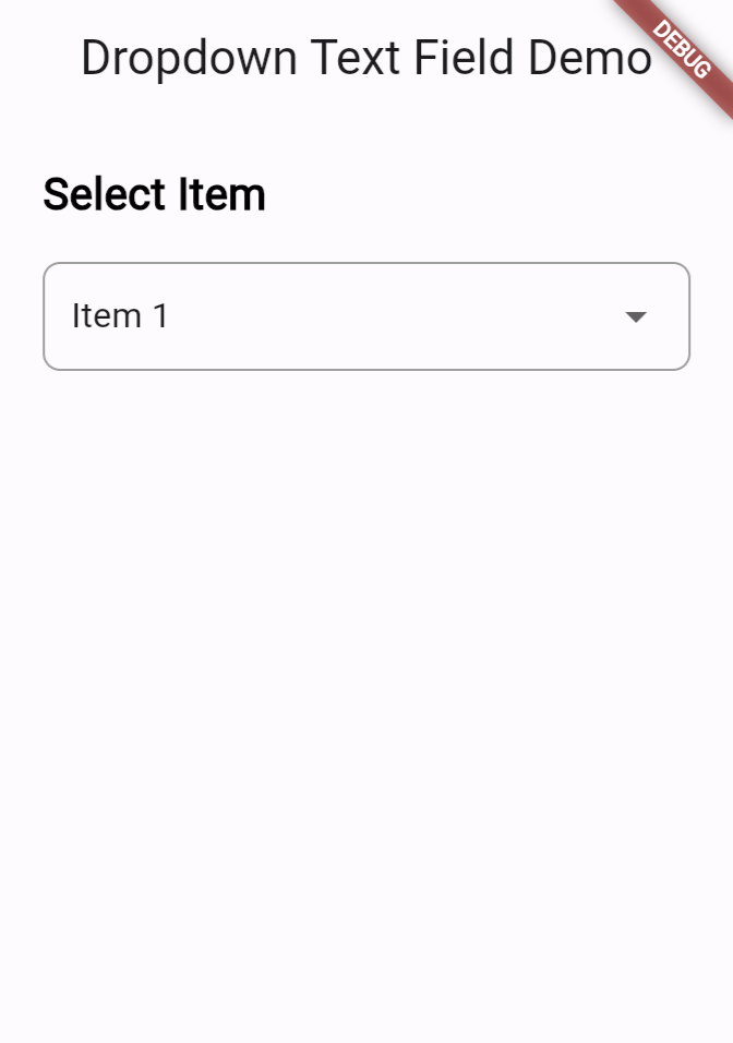
}This code sets up a basic Flutter app with a dropdown field that allows users to select an item from a list of predefined options. The DropDownTextField widget encapsulates the dropdown functionality, and it can be customized by providing a title and a list of items.
The selected item is displayed in the dropdown field, and users can change the selection by tapping on the dropdown button and selecting a different item from the list.
Full code:
import 'package:flutter/material.dart';

void main() {
  runApp(MaterialApp(
    home: Scaffold(
      appBar: AppBar(
        title: Text('Dropdown Text Field Demo'),
      ),
      body: Center(
        child: Padding(
          padding: const EdgeInsets.all(20.0),
          child: DropDownTextField(
            title: 'Select Item', // Provide a title
          ),
        ),
      ),
    ),
  ));
}

class DropDownTextField extends StatefulWidget {
  final String? title;

  const DropDownTextField({
    Key? key,
    this.title,
  }) : super(key: key);

  @override
  State<DropDownTextField> createState() => _DropDownTextFieldState();
}

class _DropDownTextFieldState extends State<DropDownTextField> {
  late String currentItem;
  List<String> listItems = ['Item 1', 'Item 2', 'Item 3']; // Demo list of items

  @override
  void initState() {
    super.initState();
    currentItem = listItems.isNotEmpty ? listItems[0] : 'No items'; // Set a default message for no items
  }

  @override
  Widget build(BuildContext context) {
    return Column(
      crossAxisAlignment: CrossAxisAlignment.start,
      children: <Widget>[
        Text(
          widget.title ?? "",
          style: TextStyle(fontSize: 20, color: Colors.black, fontWeight: FontWeight.bold), // Updated style
        ),
        SizedBox(height: 16), // Increased spacing
        Container(
          padding: EdgeInsets.symmetric(horizontal: 12),
          decoration: BoxDecoration(
            borderRadius: BorderRadius.circular(8),
            border: Border.all(color: Colors.grey), // Added border
          ),
          child: DropdownButtonHideUnderline(
            child: DropdownButton<String>(
              isExpanded: true,
              value: currentItem,
              onChanged: (String? value) {
                if (value != null) {
                  setState(() {
                    currentItem = value;
                  });
                }
              },
              items: listItems.map((String field) {
                return DropdownMenuItem<String>(
                  value: field,
                  child: Text(field),
                );
              }).toList(),
            ),
          ),
        ),
      ],
    );
  }
}
Output
Also Read
- How to create enum in Flutter?
- Form Validation in Flutter: A Step-by-Step Guide
- How to Implement Multi-layer Dropdown List in Flutter?
- How to Customize Dropdown Button Using Dropdownbuttonformfield in Flutter?
Conclusion
In this blog post, we’ve covered the basics of creating a dropdown in Flutter. We created a custom DropDownTextField widget that encapsulates the dropdown functionality and demonstrated how to use it in a Flutter app.
With this knowledge, you can now easily integrate dropdowns into your Flutter projects and customize them to suit your app’s design needs.

About Ambika Dulal
Lead Mobile App Developer and Tech Consultant specializing in Flutter, Dart, and Firebase.