How to Add Border to Card in Flutter?
Want to add some style to your cards in your Flutter app? Learn how to easily add border to card in Flutter! This quick guide will show you various methods to achieve different border styles.
By customizing the borders, you can make your cards stand out and improve the overall look of your app.
Table of Contents
Steps to Add Border to Card in Flutter
In this tutorial, I’ll demonstrate two simple examples to add borders to cards. Let’s dive in and get started!
Add Border to Card in Flutter Example 1
import 'package:flutter/material.dart';

void main() {
  runApp(MyApp());
}

class MyApp extends StatelessWidget {
  @override
  Widget build(BuildContext context) {
    return MaterialApp(
      title: 'Card Border Example',
      home: Scaffold(
        appBar: AppBar(
          title: Text('Card Border Example'),
        ),
        body: Center(
          child: Padding(
            padding: const EdgeInsets.all(16.0),
            child: Card(
              shape: BeveledRectangleBorder(
                borderRadius: BorderRadius.circular(12.0),
                side: BorderSide(
                  color: Colors.blue,
                  width: 2.0,
                ),
              ),
              elevation: 8.0,
              child: Padding(
                padding: const EdgeInsets.all(24.0),
                child: Column(
                  mainAxisSize: MainAxisSize.min,
                  children: [
                    CircleAvatar(
                      radius: 40.0,
                      backgroundImage: NetworkImage(
                        'https://secure.gravatar.com/avatar/5145787102babbbb9d473e249212ebda?s=500',
                      ),
                    ),
                    SizedBox(height: 16.0),
                    Text(
                      'Ambika Dulal',
                      style: TextStyle(
                        fontSize: 24.0,
                        fontWeight: FontWeight.bold,
                      ),
                    ),
                    SizedBox(height: 8.0),
                    Text(
                      'Flutter Developer',
                      style: TextStyle(
                        fontSize: 16.0,
                        color: Colors.grey.shade600,
                      ),
                    ),
                  ],
                ),
              ),
            ),
          ),
        ),
      ),
    );
  }
}
In this example:
- We create a
MaterialAppand aScaffoldwith anAppBar. - Inside the
bodyof theScaffold, we add aCenterwidget and aPaddingwidget to add some spacing around theCard. - The
Cardwidget uses theshapeproperty to set theBeveledRectangleBorderwith aborderRadiusof12.0and asideproperty that defines the border color (Colors.blue) and width (2.0). - We also set the
elevationproperty of theCardto8.0to add a shadow effect. - Inside the
Card, we add anotherPaddingwidget to add some spacing between the card border and the content. - The content of the card consists of a
Columnwith aCircleAvatar(displaying an image from a network URL), aTextwidget for the name, and anotherTextwidget for the job title.
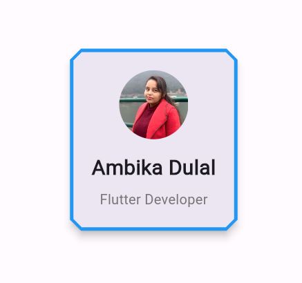
When you run this code, you’ll see a centered card with a beveled rectangle border of blue color and a width of 2 pixels. The card also has an elevation of 8, which adds a shadow effect.
Inside the card, there’s a profile image, a name, and a job title displayed vertically.
You can customize the border shape, color, width, elevation, and other properties as per your requirements. You can also modify the content of the card to display different information or add additional widgets.
Output:
Also Read:
- How to Add Border Radius to Container Flutter?
- TextButton with rounded corner and circle border in flutter
Add Border to Card in Flutter Example 2
import 'package:flutter/material.dart';

void main() {
  runApp(MyApp());
}

class MyApp extends StatelessWidget {
  @override
  Widget build(BuildContext context) {
    return MaterialApp(
      home: Scaffold(
        appBar: AppBar(
          title: Text('Card with Border Example'),
        ),
        body: Center(
          child: Card(
            elevation: 4, // Adjust the elevation as needed
            shape: RoundedRectangleBorder(
              borderRadius: BorderRadius.circular(15.0), // Adjust the border radius as needed
              side: BorderSide(
                color: Colors.blue, // Set the border color here
                width: 2.0, // Set the border width here
              ),
            ),
            child: Padding(
              padding: EdgeInsets.all(20.0),
              child: Text(
                'This is an AppOverride Card Example.',
                style: TextStyle(fontSize: 18.0),
              ),
            ),
          ),
        ),
      ),
    );
  }
}
In this example:
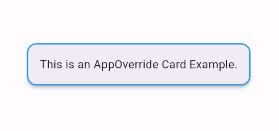
Cardwidget is used to create a card.elevationproperty is set to give the card a shadow effect.shapeproperty is used to define the shape of the card. Here,RoundedRectangleBorderis used with a circular border radius of 15.0.sideproperty insideBorderSideis used to specify the border color and width.Paddingwidget is used to add padding inside the card to make the text look better.- Inside the
Card, aTextwidget is used to display some text.
Output
Conclusion
In short, adding borders to cards in Flutter opens up countless possibilities to enhance the visual appeal and user experience of your app.
With Flutter’s flexible UI components, you can customize the border style, color, width, and other properties to craft unique and captivating card designs that seamlessly blend with your app’s branding.
By combining border customization with other card properties like elevation and content styling, you can achieve truly immersive and engaging user interfaces that set your app apart from the competition.
You can Follow the official documentation to set up Flutter: Flutter Installation Guide.

About Ambika Dulal
Lead Mobile App Developer and Tech Consultant specializing in Flutter, Dart, and Firebase.