How to Change Color of Elevatedbutton in Flutter?
By the end of this tutorial, you’ll know how to Change Color of Elevatedbutton in Flutter, providing a personalized touch to your Flutter app’s user interface. Let’s dive into the details and elevate the style of your ElevatedButton in just a few simple steps.
In this guide, we will explore the process of customizing the color of an ElevatedButton to enhance its visual appeal and align it with your app’s design scheme.
Table of Contents
Introduction of change color of Elevatedbutton in Flutter
Flutter, the versatile UI toolkit from Google, empowers developers to create visually appealing and responsive applications.
One crucial component in app design is offering a simple and effective way to trigger actions. In this blog post, we’ll explore how you can elevate your Flutter app by customizing the color and style of the ElevatedButton.
Changing the Elevated Button Color
The color scheme of your app contributes significantly to its visual identity. With Flutter, altering the color of an ElevatedButton is a breeze.
By utilizing the ButtonStyle class and its backgroundColor property, you can infuse your button with a vibrant hue. Let’s dive into the code:
ElevatedButton(
  onPressed: () {
    // Add your button functionality here
  },
  style: ButtonStyle(
    backgroundColor: MaterialStateProperty.all<Color>(Colors.blue), // Change button color
  ),
  child: Text('Press me'),
)
In this snippet, the backgroundColor is set to Colors.blue, transforming the button into a captivating blue. Feel free to experiment with different colors to align with your app’s theme.
Customizing the Elevated Button Style
Beyond color, the visual style of your ElevatedButton can be further customized using various properties offered by the ButtonStyle class. Let’s explore an extended example:
ElevatedButton(
  onPressed: () {
    // Add your button functionality here
  },
  style: ButtonStyle(
    backgroundColor: MaterialStateProperty.all<Color>(Colors.blue), // Change button color
    foregroundColor: MaterialStateProperty.all<Color>(Colors.white), // Change text color
    elevation: MaterialStateProperty.all<double>(8.0), // Change button elevation
    padding: MaterialStateProperty.all<EdgeInsetsGeometry>(
      EdgeInsets.symmetric(horizontal: 16.0, vertical: 12.0), // Change button padding
    ),
    shape: MaterialStateProperty.all<OutlinedBorder>(
      RoundedRectangleBorder(
        borderRadius: BorderRadius.circular(20.0), // Change button border radius
      ),
    ),
  ),
  child: Text('Press me'),
)
In this example, we’ve customized various properties, including foregroundColor for text color, elevation for a 3D effect, padding for button spacing, and shape for a rounded button.
Full code:
import 'package:flutter/material.dart';
void main() {
runApp(MyApp());
}
class MyApp extends StatelessWidget {
@override
Widget build(BuildContext context) {
return MaterialApp(
title: 'Custom ElevatedButton Example',
theme: ThemeData(
primarySwatch: Colors.blue,
),
home: MyHomePage(),
);
}
}
class MyHomePage extends StatelessWidget {
@override
Widget build(BuildContext context) {
return Scaffold(
appBar: AppBar(
title: Text('Custom ElevatedButton Example'),
),
body: Center(
child: Text('Welcome to your Flutter app!'),
),
floatingActionButton: ElevatedButton(
onPressed: () {
// Add your button functionality here
print('Button Pressed!');
},
style: ButtonStyle(
backgroundColor: MaterialStateProperty.all<Color>(Colors.blue), // Change button color
foregroundColor: MaterialStateProperty.all<Color>(Colors.white), // Change text color
elevation: MaterialStateProperty.all<double>(8.0), // Change button elevation
padding: MaterialStateProperty.all<EdgeInsetsGeometry>(
EdgeInsets.symmetric(horizontal: 16.0, vertical: 12.0), // Change button padding
),
shape: MaterialStateProperty.all<OutlinedBorder>(
RoundedRectangleBorder(
borderRadius: BorderRadius.circular(20.0), // Change button border radius
),
),
),
child: Text('Press me'),
),
);
}
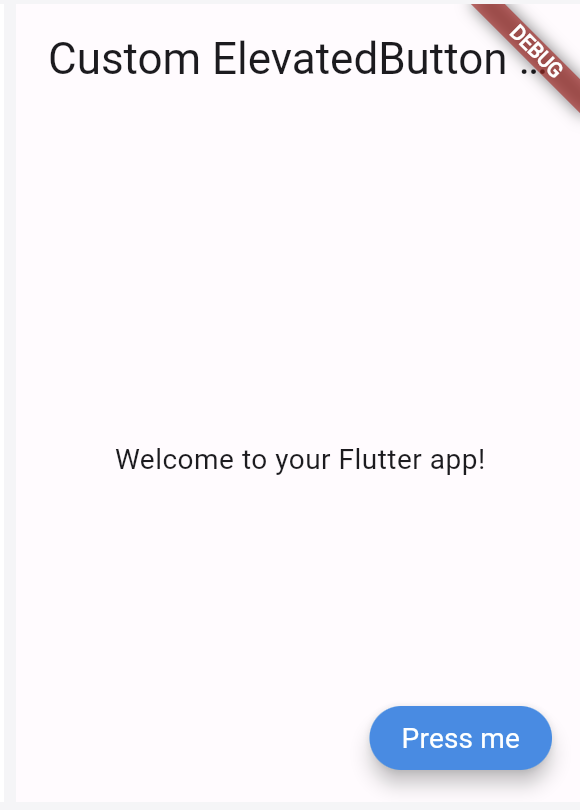
}Outputs:
Also, Read Related Tutorials
- A RenderFlex overflowed by 36 pixels on the right using row
- How to hide debug banner from the application main page in Flutter?
Conclusion
Customizing the color and style of an ElevatedButton in Flutter is a journey into creativity. With the ButtonStyle class, you can effortlessly infuse your buttons with personality, ensuring they seamlessly integrate into your app’s overall aesthetic.
This code creates a simple Flutter app with a centered text widget and an ElevatedButton. The ElevatedButton is customized with a blue background color, white text color, increased elevation, adjusted padding, and a rounded border.
Feel free to modify the code according to your design preferences and requirements.

About Ambika Dulal
Lead Mobile App Developer and Tech Consultant specializing in Flutter, Dart, and Firebase.