How to Add ListTile in Flutter? (with Example)

This blog will delve into the ListTile in Flutter widget, exploring its various use cases with comprehensive code examples. Among the myriad of widgets it offers, the ListTile widget stands out for its simplicity and versatility.
Table of Contents
- What is a ListTile in Flutter?
- Basic ListTile in Flutter
- Customizing ListTile in Flutter
- Flutter ListTile with Checkbox
- Flutter ListTile with Switch
- Flutter ListTile with Radio Button
- Flutter ListTile with ExpansionTile
- Conclusion
What is a ListTile in Flutter?
ListTile is a single fixed-height row that typically contains some text as well as a leading or trailing icon. It’s a common pattern used in many applications, especially for displaying a list of items.
Basic ListTile in Flutter
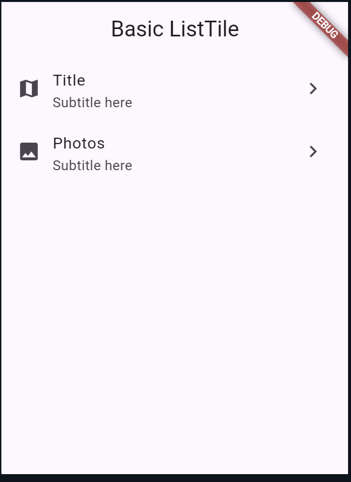
A basic ListTile includes a title, subtitle, leading icon, and trailing icon. Here’s a simple example:
import 'package:flutter/material.dart';

void main() => runApp(MyApp());

class MyApp extends StatelessWidget {
  @override
  Widget build(BuildContext context) {
    return MaterialApp(
      home: Scaffold(
        appBar: AppBar(title: Text('it is a ListTile')),
        body: ListView(
          children: <Widget>[
            ListTile(
              leading: Icon(Icons.map),
              title: Text('Title'),
              subtitle: Text('Subtitle here'),
              trailing: Icon(Icons.navigate_next),
              onTap: () {
                print('Title tapped');
              },
            ),
            ListTile(
              leading: Icon(Icons.photo),
              title: Text('Photos'),
              subtitle: Text('Subtitle here'),
              trailing: Icon(Icons.navigate_next),
              onTap: () {
                print('Photos tapped');
              },
            ),
          ],
        ),
      ),
    );
  }
}
Output:
Customizing ListTile in Flutter
You can customize the ListTile to suit your needs by adjusting its properties or wrapping it with other widgets. For instance, to change the background color or padding:
ListTile(
  leading: Icon(Icons.map),
  title: Text('Title'),
  subtitle: Text('Subtitle here'),
  trailing: Icon(Icons.navigate_next),
  onTap: () {
    print('Title tapped');
  },
  tileColor: Colors.grey[200],
  contentPadding: EdgeInsets.symmetric(horizontal: 20.0, vertical: 10.0),
);
Flutter ListTile with Checkbox
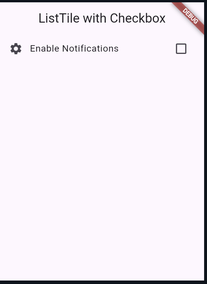
Using a ListTile with a Checkbox can be useful for settings or selection scenarios:
class MyApp extends StatefulWidget {
  @override
  _MyAppState createState() => _MyAppState();
}

class _MyAppState extends State<MyApp> {
  bool _isChecked = false;

  @override
  Widget build(BuildContext context) {
    return MaterialApp(
      home: Scaffold(
        appBar: AppBar(title: Text('ListTile with Checkbox')),
        body: ListView(
          children: <Widget>[
            ListTile(
              leading: Icon(Icons.settings),
              title: Text('Enable Notifications'),
              trailing: Checkbox(
                value: _isChecked,
                onChanged: (bool? value) {
                  setState(() {
                    _isChecked = value!;
                  });
                },
              ),
              onTap: () {
                setState(() {
                  _isChecked = !_isChecked;
                });
              },
            ),
          ],
        ),
      ),
    );
  }
}

void main() => runApp(MyApp());
Output:
Flutter ListTile with Switch
Similarly, you can use a ListTile with a Switch widget for toggling settings:
class MyApp extends StatefulWidget {
  @override
  _MyAppState createState() => _MyAppState();
}

class _MyAppState extends State<MyApp> {
  bool _isSwitched = false;

  @override
  Widget build(BuildContext context) {
    return MaterialApp(
      home: Scaffold(
        appBar: AppBar(title: Text('ListTile with Switch')),
        body: ListView(
          children: <Widget>[
            ListTile(
              leading: Icon(Icons.wifi),
              title: Text('Wi-Fi'),
              trailing: Switch(
                value: _isSwitched,
                onChanged: (bool value) {
                  setState(() {
                    _isSwitched = value;
                  });
                },
              ),
              onTap: () {
                setState(() {
                  _isSwitched = !_isSwitched;
                });
              },
            ),
          ],
        ),
      ),
    );
  }
}

void main() => runApp(MyApp());
output:

Flutter ListTile with Radio Button
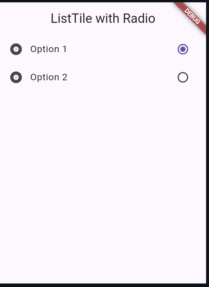
For selecting one option from a list, use a ListTile with a Radio widget:
class MyApp extends StatefulWidget {
  @override
  _MyAppState createState() => _MyAppState();
}

class _MyAppState extends State<MyApp> {
  int _selectedRadio = 0;

  @override
  Widget build(BuildContext context) {
    return MaterialApp(
      home: Scaffold(
        appBar: AppBar(title: Text('ListTile with Radio')),
        body: ListView(
          children: <Widget>[
            ListTile(
              leading: Icon(Icons.album),
              title: Text('Option 1'),
              trailing: Radio(
                value: 1,
                groupValue: _selectedRadio,
                onChanged: (int? value) {
                  setState(() {
                    _selectedRadio = value!;
                  });
                },
              ),
              onTap: () {
                setState(() {
                  _selectedRadio = 1;
                });
              },
            ),
            ListTile(
              leading: Icon(Icons.album),
              title: Text('Option 2'),
              trailing: Radio(
                value: 2,
                groupValue: _selectedRadio,
                onChanged: (int? value) {
                  setState(() {
                    _selectedRadio = value!;
                  });
                },
              ),
              onTap: () {
                setState(() {
                  _selectedRadio = 2;
                });
              },
            ),
          ],
        ),
      ),
    );
  }
}

void main() => runApp(MyApp());
Output:
Flutter ListTile with ExpansionTile
An ExpansionTile allows you to expand or collapse a tile to reveal more content. It’s useful for grouping related items or showing additional information on demand:
class MyApp extends StatelessWidget {
  @override
  Widget build(BuildContext context) {
    return MaterialApp(
      home: Scaffold(
        appBar: AppBar(title: Text('ExpansionTile Example')),
        body: ListView(
          children: <Widget>[
            ExpansionTile(
              leading: Icon(Icons.info),
              title: Text('More Information'),
              children: <Widget>[
                ListTile(
                  leading: Icon(Icons.account_circle),
                  title: Text('Profile'),
                  onTap: () {},
                ),
                ListTile(
                  leading: Icon(Icons.settings),
                  title: Text('Settings'),
                  onTap: () {},
                ),
              ],
            ),
          ],
        ),
      ),
    );
  }
}

void main() => runApp(MyApp());
Also read:
Conclusion
ListTile is a powerful and flexible widget in Flutter that can be adapted to various use cases, from basic lists to complex settings menus. Whether you’re building a simple list or a dynamic interface with selectable items, [ListTile](https://api.flutter.dev/flutter/material/ListTile-class.html) can help you create clean and intuitive UIs.
By understanding and utilizing the different properties and variations of ListTile, you can significantly enhance the user experience of your Flutter applications.

About Ambika Dulal
Lead Mobile App Developer and Tech Consultant specializing in Flutter, Dart, and Firebase.